Case Study: Selecting an Airplane
Description
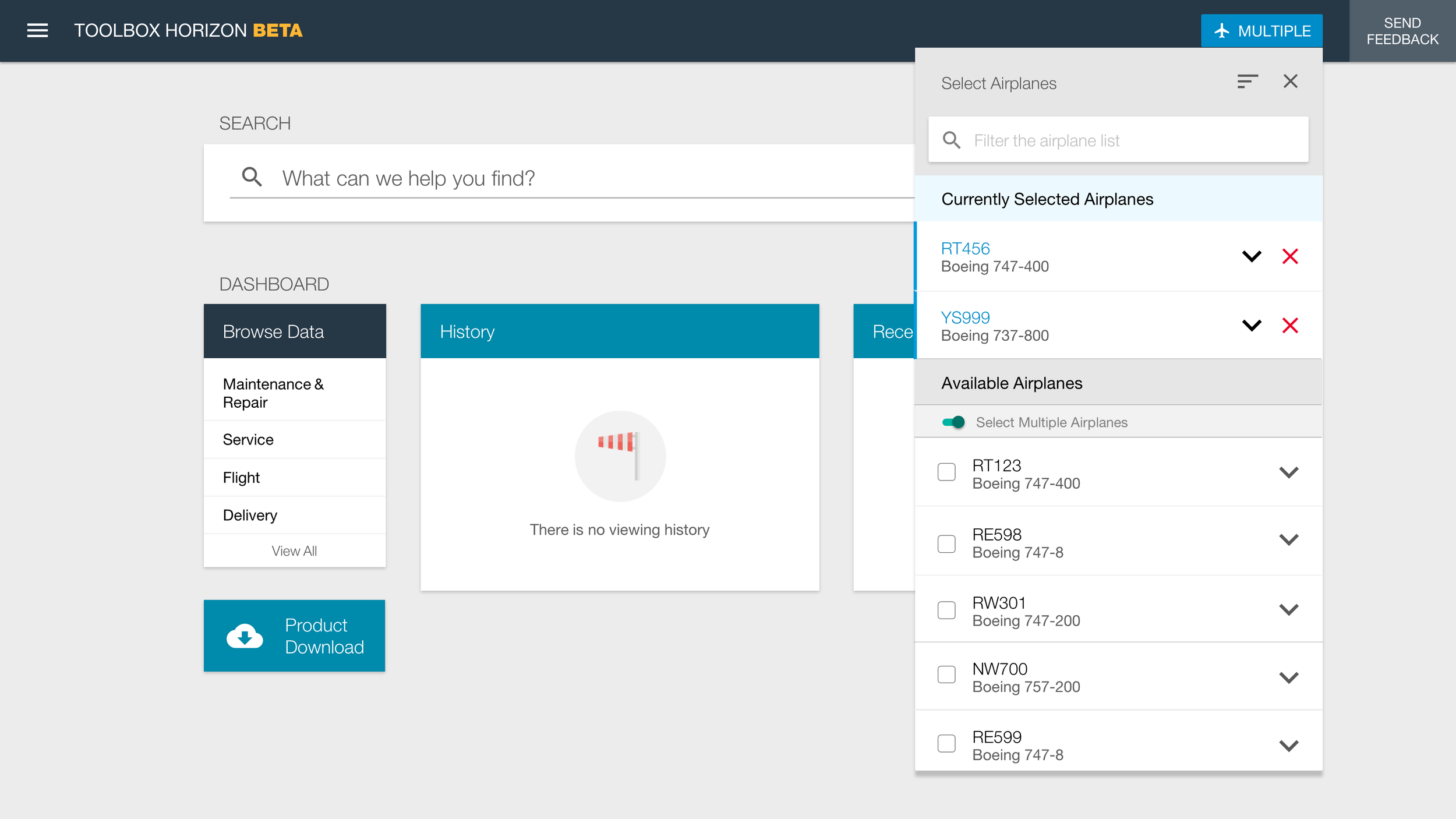
In order for Maintenance Performance Toolbox to show the correct data for a specific airplane, a user needs to select that airplane. This enables the application to hide data that isn't applicable to the selected airplane.
Problem
Prior to the redesign, the Select an Airplane function didn’t work across Toolbox's multiple tabs, even though it looked like it should. This caused a lot of confusion for end users. Moreover, the interaction required multiple steps; even different steps depending on the selected tab. The interaction presented at random times and was hard to use. Worst of all, this could potentially lead to the wrong technical data being displayed for maintenance on an airplane.
Research
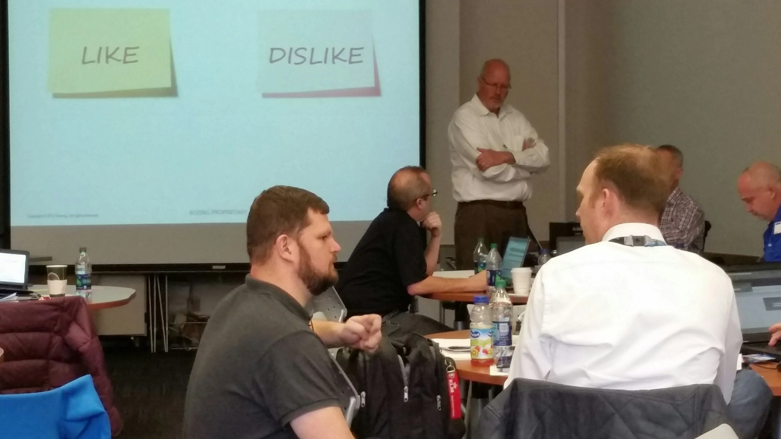
This problem was identified through a product feedback and discussion session and survey, during an on-site customer workshop. We identified a number of areas to work over the week. We started with the items with no positive feedback. Each item got a live walkthrough in the current product, discussion, scenario-based user observation, and a likes/dislikes exercise.
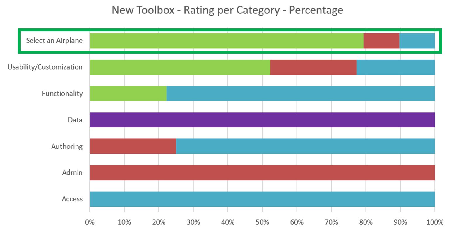
Survey results showing 0% approval for Select an Airplane
Airline attendees participating in a Likes/Dislikes exercise
Design
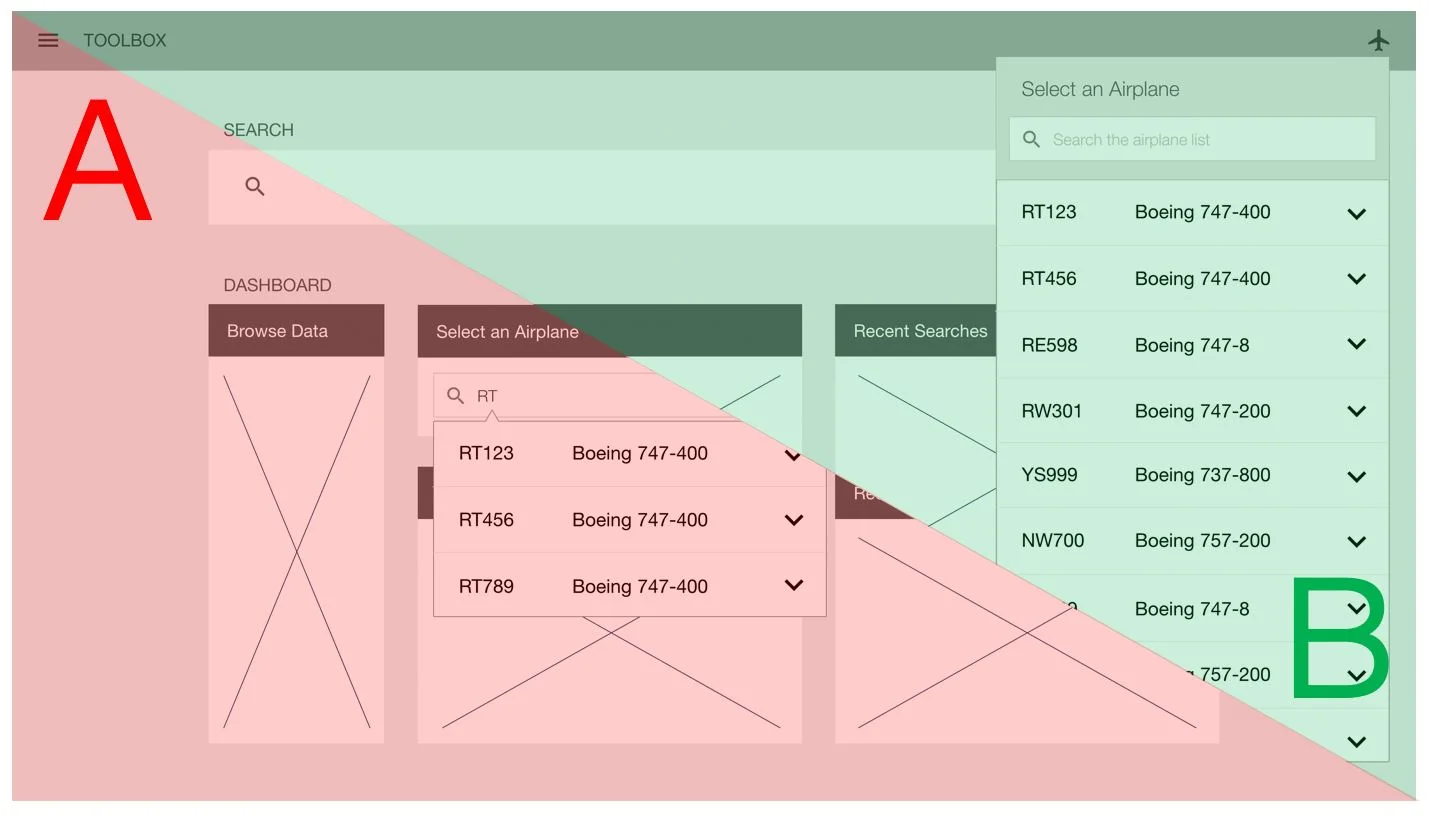
After our Select an Airplane discussion session, I sketched two potential solutions that could work within the design paradigm. After reviewing the sketches with some power users, and getting necessary feedback, I created wireframes for both of the workflows that evening.
A sketch of a Dashboard widget workflow
A wireframe from the Dasbhoard widget workflow
A sketch of a header bar workflow
A wireframe from the header bar workflow
Share
The next day, I walked through the workflows for both designs using the wireframes. The airline attendees discussed their likes and dislikes of both designs, feedback was captured per our process. We performed A/B testing on the two designs. Of the 17 airline users in attendance, only one person preferred option A.
Me talking with a workshop attendee during a Like/Dislike exercise
A/B Testing results
Iterate
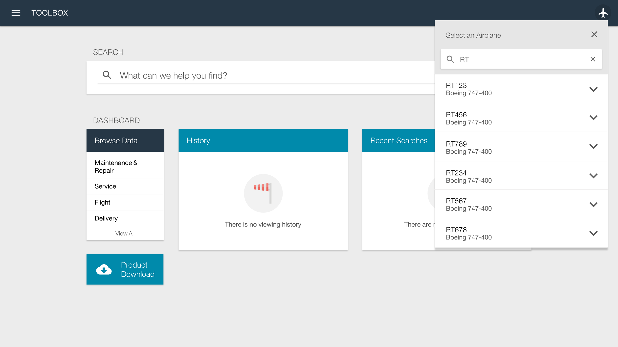
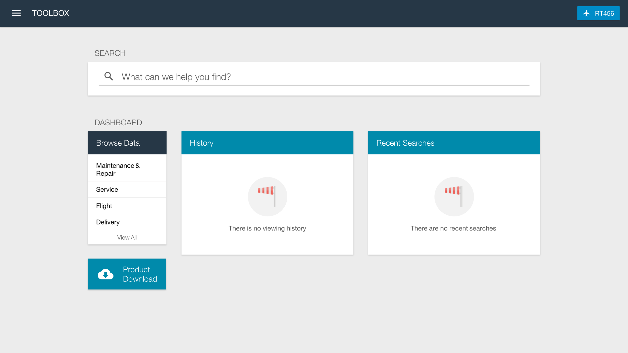
Three months before starting development of Select an Airplane, I referred to the workshop wireframes, and feedback, to build the first round of mockups (below). I walked through the design during our monthly customer call. Per our process, each of the participants gave feedback as likes and dislikes, with elaboration.
Feedback from the Mockup Review
Likes
- Simple, clean, intuitive design
- Always available in the header
- Very few steps to select airplane
- Airplane list is searchable
- Users can always see selected airplane
Dislikes
- No support for selecting a range of airplanes
- No ability to select multiple airplanes
- No customization to change the airplane ID type
- No ability to sort the list
Review
Prior to development starting, I made a final iteration of the mockups (below), incorporating much of their feedback (e.g., multi-select airplanes, sorting, change airplane ID) into the designs. I reviewed these final designs with the customers on the monthly customer call, included them in our monthly project newsletter, and walked through them during on-site visits. Where appropriate, I made them into clickable prototypes for users to walk through.
Talking with end users during an on-site research trip
Walking end users through a prototype design
Deliver
I redlined the final mockups*, updated the online style guide (if needed), and worked with my front end development team to build the functional prototype. These were packaged up and provided to the backend development team during sprint planning. From there, it was integrated into the production version.
* I don't have the redlines for this mockup, another example provided.
Redlines from an iteration of the Browse Data design
We built an web style guide that was made available for developers
Results
Prior to the redesign, there was 0% positive feedback for the Select an Airplane feature. After the redesign was implemented, using the design process shown during this case study, the feature got 79% positive feedback from our customer advisors.
Updated survey results showing 79% approval ratings


